CF Napa Ties the Knot with Turks Head
Pennsylvania’s Main Line Wine Company has a unique proposition. Their 12,000-square-foot building in West Chester is home to a wine lounge, tasting room, and a community wine education center exclusively serving their flagship brand, Turks Head, sourced from vineyards in Napa and Sonoma. The brand name pays homage to the Turks Head Tavern, a landmark bar that played a vital role in the history of West Chester, with the town taking on the name Turks Head before the name was officially changed to West Chester.

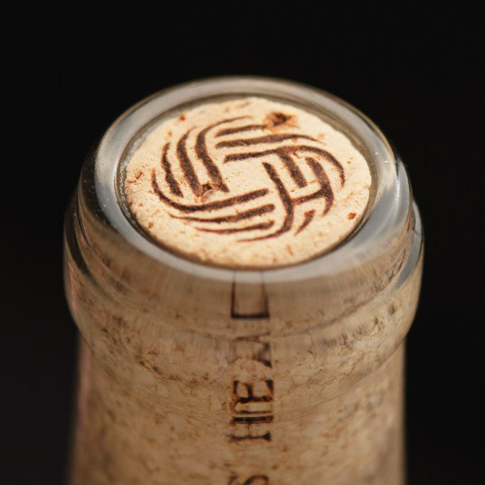
The project objective was to create an upscale, exclusive brand look and feel that was simple, elegant, and easily recognizable. CF Napa was inspired by the clean and elegant design of the tasting room and the brand’s namesake the Turk’s head knot, also referred to as a sailor's knot. CF Napa drew an icon based on the Turk’s head knot, which historically has been used as a symbol of unity and connection. CF Napa incorporated an interlocking TH monogram which is hidden in the knot, representing the Turks Head wine brand’s unbreakable tie to the community.

The icon not only ties to the history of the town but is strong and easily recognizable with an ability to stand on its own across multiple brand applications. The knot was embossed with gold foil to pop against the clean white labels.
The label system was designed for flexibility, easily accommodating a large number of SKUs while retaining a strong brand identity. A color-coding system was developed to differentiate between the acclaimed AVAs and to support the brand’s educational teachings on the impact of terroir.
Drink With Your Eyes®


